There’s a genre of LinkedIn content doing very well right now – you know it when you see it.
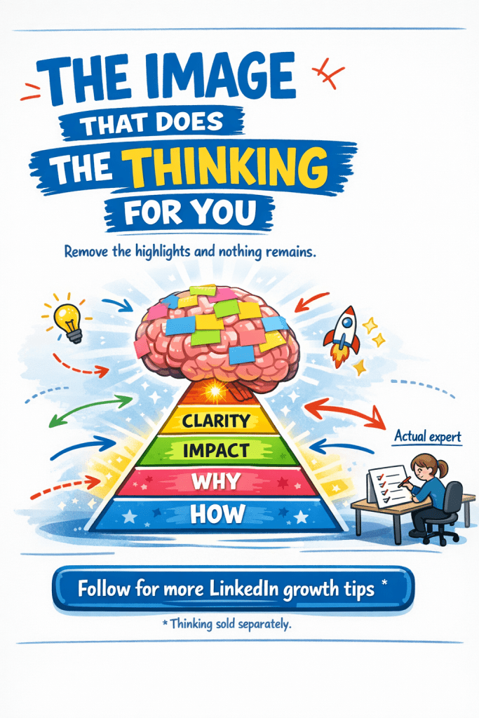
Colourful, hand-drawn aesthetic. Highlighted keywords. Emoji. A pyramid. Bullet points inside bullet points. A heading that says “The Why” followed by a heading that says “The How.”
I saw one this week titled “Clear Thinking = Strong Branding.”
It told me that weak brands are vague about why they exist. That I should avoid being everything to everyone. That jargon and complex stories confuse the market. That I should, and I’m almost quoting here, “ruthlessly cut the clutter.”
None of that is insight; it’s the restatement of received wisdom, formatted to look like a breakthrough.
Here’s what gives it away: remove the highlighting, the arrows, and the pyramid, and nothing remains. The visual design is load-bearing. It’s doing the work that thinking should be doing.
The format is AI-characteristic not because it was necessarily written by AI, but because it exhibits what AI does when it hasn’t been given a strong enough brief: it surfaces the obvious, treats everything as equally important, and compensates with presentation.
A human author with genuine expertise cuts things. They know which point is the one that matters and they’re willing to leave the other four out.
The sign at the bottom read: “Follow for more LinkedIn growth tips.”
That’s the tell.
The content isn’t about branding but building a following through material that feels substantive without requiring the reader, or the writer, to think very hard.
The uncomfortable part? It’s working.
